Dear Readers, I’m happy to announce that the Film & TV Newsletter Catalogs are back! After several months of inactivity, my directory of film and TV Substack newsletters has been revamped and can now once again be updated with new entries.
I have a backlog of submissions that I’ll be adding over the course of this month and I have to figure out exactly how I will announce these updates - maybe in the MTVD digests? - but for now I wanted to make sure folks and prospective new authors are aware that the FTNC is up and running again. So, please explore it, and maybe you’ll find an interesting newsletter or two.
Now, if you’ve been reading this site regularly over the course of this year, you should know that the page suffered from technical issues and I had to stop updating it.
So, what happened exactly? To explain this, I need to talk a little bit about the design of the directory. The FTNC project took some time to come together. Though I had the idea for it early into my second year on the platform, I couldn’t figure out a way to present the many newsletter links I’d found in an interesting way.
The simple fact is that Substack’s interface doesn’t offer that many text formatting and page layout options. It’s not possible to have different parts of the text appear in different colors, for example, and there’s no button that allows placing the text in the center of a line. So, I needed to come up with a design for this directory that would be visually attractive yet also work within the limits of the Substack interface.
At one point, I thought about just using the native embedded links format. As in, you post a link to a Substack newsletter and it gets converted into an embedded link that allows one to subscribe to it. Here’s an example:
Pretty simple, right? But this turned out to be untenable. When you post a hundred Substack links, the embeds take up way too much space and to be honest, they just don’t always look that well in the interface.
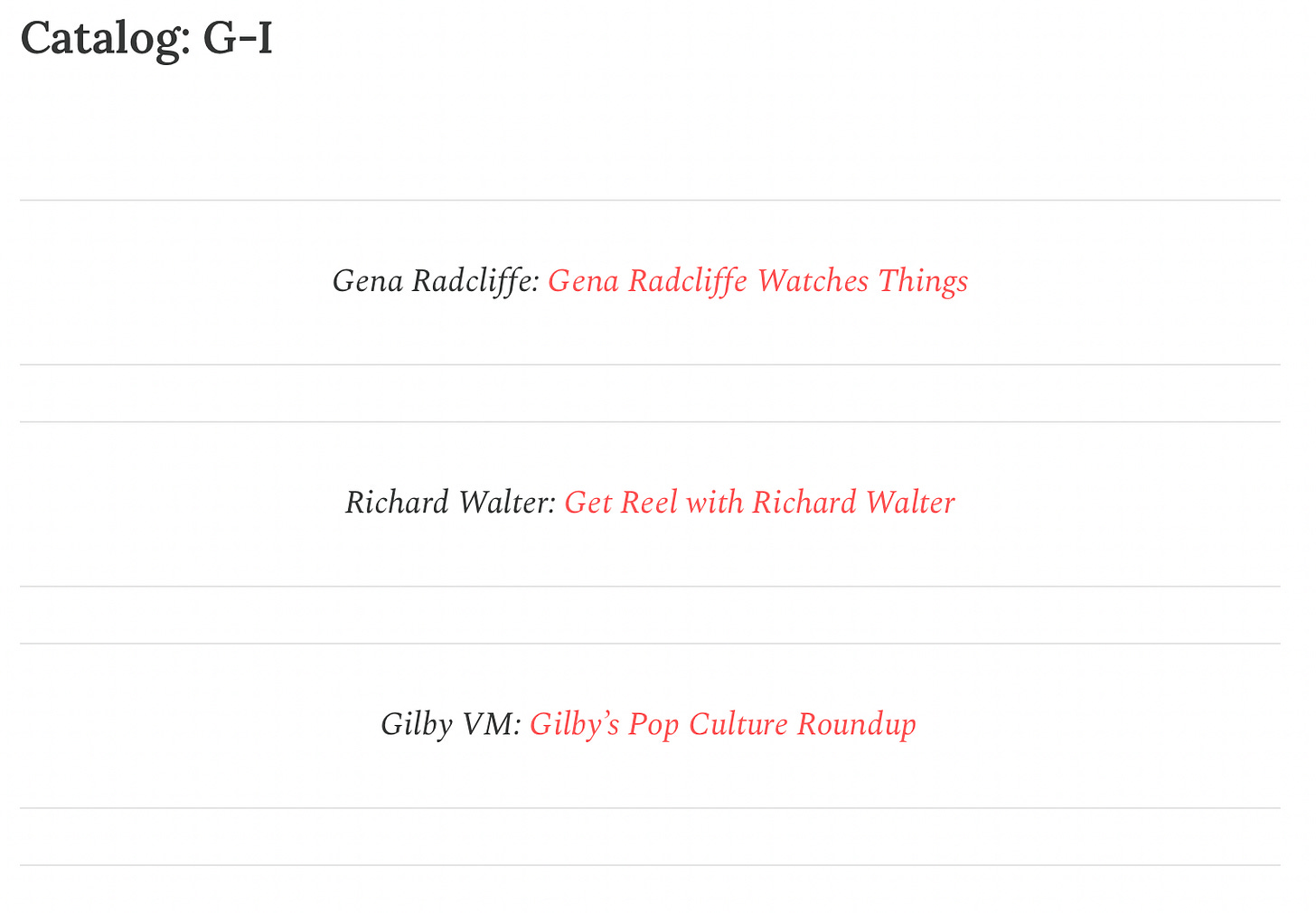
After experimenting and doing more tests, I found that it was possible to actually center text using the “pull quote” option in the format tab. This also created some nice little divider lines that helped single out individual entries.
But there were still a lot of questions I struggled with. How do I make a listing of newsletters look interesting? What information should I include? Just the publication link? Or the name of the author? Perhaps the description?
I wanted to make sure readers would be able to get a sense of what the publication was about, but I also didn’t want to bog things down with too much information. The directory should be easy to read and browse, not cumbersome.
And then, Substack introduced the ‘Mention’ feature, which offered a solution to all my problems. Now, the name of the newsletter could be of a different color and highlighting it would give one a nice-looking pop-up with additional information, including the Substack description, and the proper link. And authors would receive notifications that their newsletters had been mentioned in it.
Combine this with the pull quote and the directory was ready!
Now that I had settled on the design, I could regularly update the FTNC with new entries. This worked for a while. But when I tried to update the FTNC earlier this year, I was blocked from doing so.
A pop up message informed me that the page could not be updated as some authors had chosen to disable mentions of their name and/or Substack.1 So, I now had to remove all newsletters with disabled mentions if I wanted to update the page at all.
The problem was there was no way to determine who exactly had disabled mentions. It could’ve been anyone out of the 100+ entries listed on the page at this point.2
My only solution was to revamp the directory entirely and make it work without men-tions. This was not easy. I again had to do a bunch of tests and try different design templates. I also had to check every single link I had at this point, make sure it worked, copy it and manually link it to a publication’s name.3
Little by little though, things progressed and I settled on a design that uses the “Code Block” formatting option. Now, the name of the publication and its author(s) appears inside a Code Block while a description follows below.4
I hope you all enjoy the revamped FTNC! I don’t know how relevant it will be in the future, given that Substack seems to be finally rolling out a “Movies & TV” category, but I hope it helps folks discover some interesting writing on the topic.
I have wondered if perhaps this was my fault. Did people get mention notifications every single time I updated it? I can imagine some would get tired of or bothered by this.
Word of advice to other writers - be careful about using the ‘mention’ feature in your posts. Not everybody likes to be tagged.
In the process I discovered multiple publications listed had by this point shut down or become completely inactive.
I can’t guarantee this looks well on a phone, but I do think it looks nice in the browser.


🙏